All work

Design system uplift

Turning a component library nobody trusted into the default way four teams build UI.

Company
Northwind (demo)
Year
2024
Role
Led it
Team
6–15 people
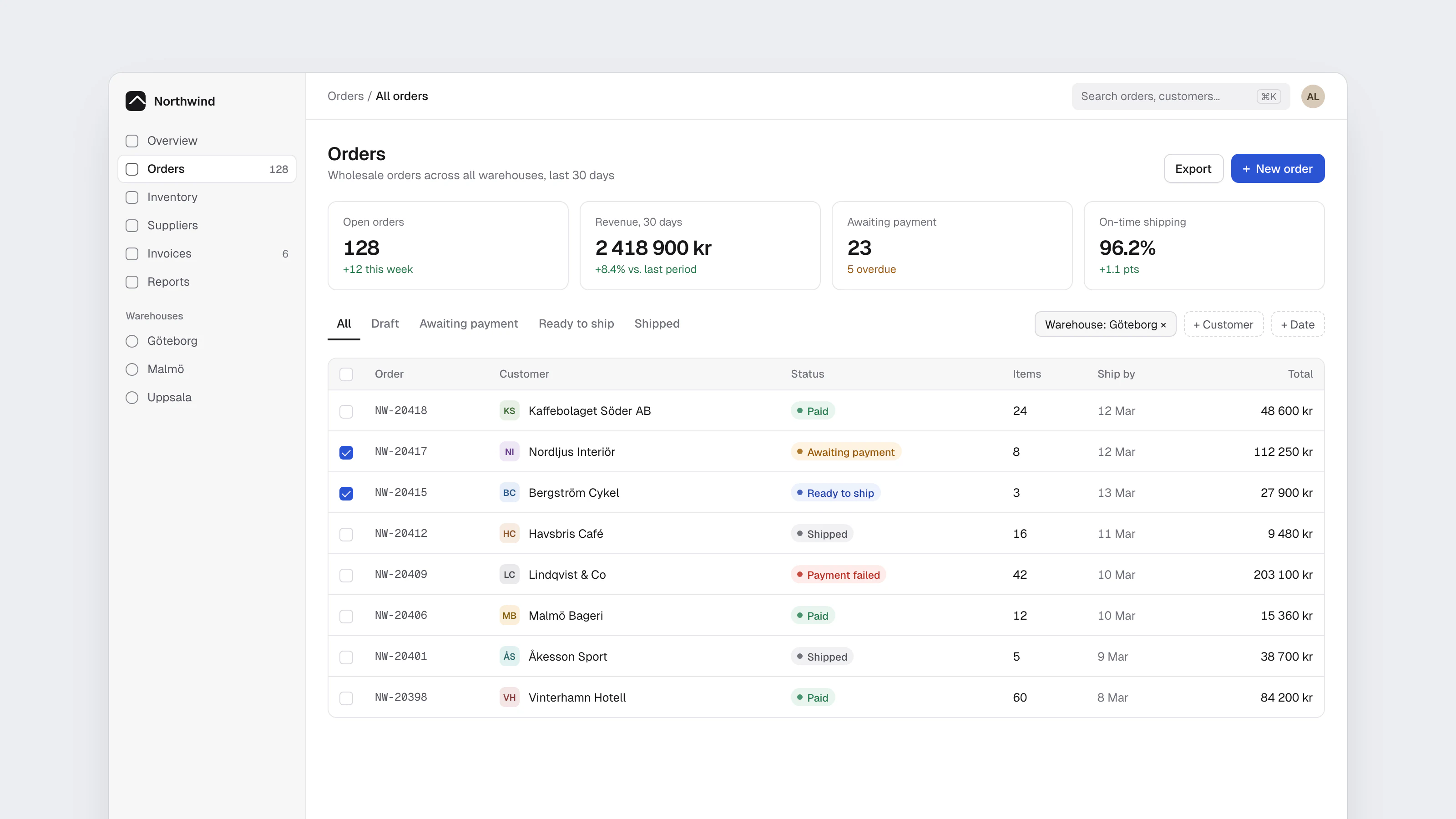
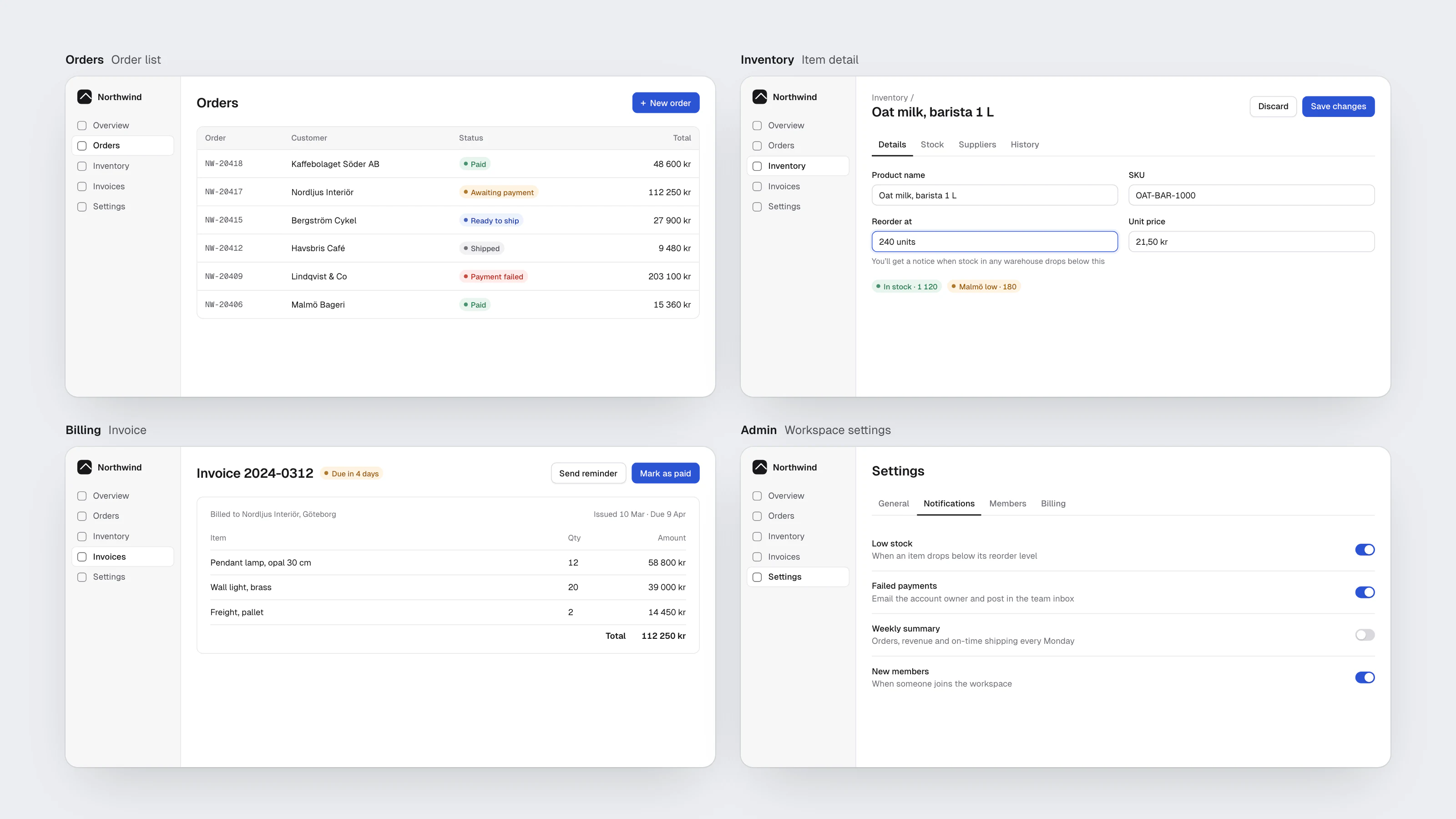
Northwind's Orders screen, built entirely from Keel components

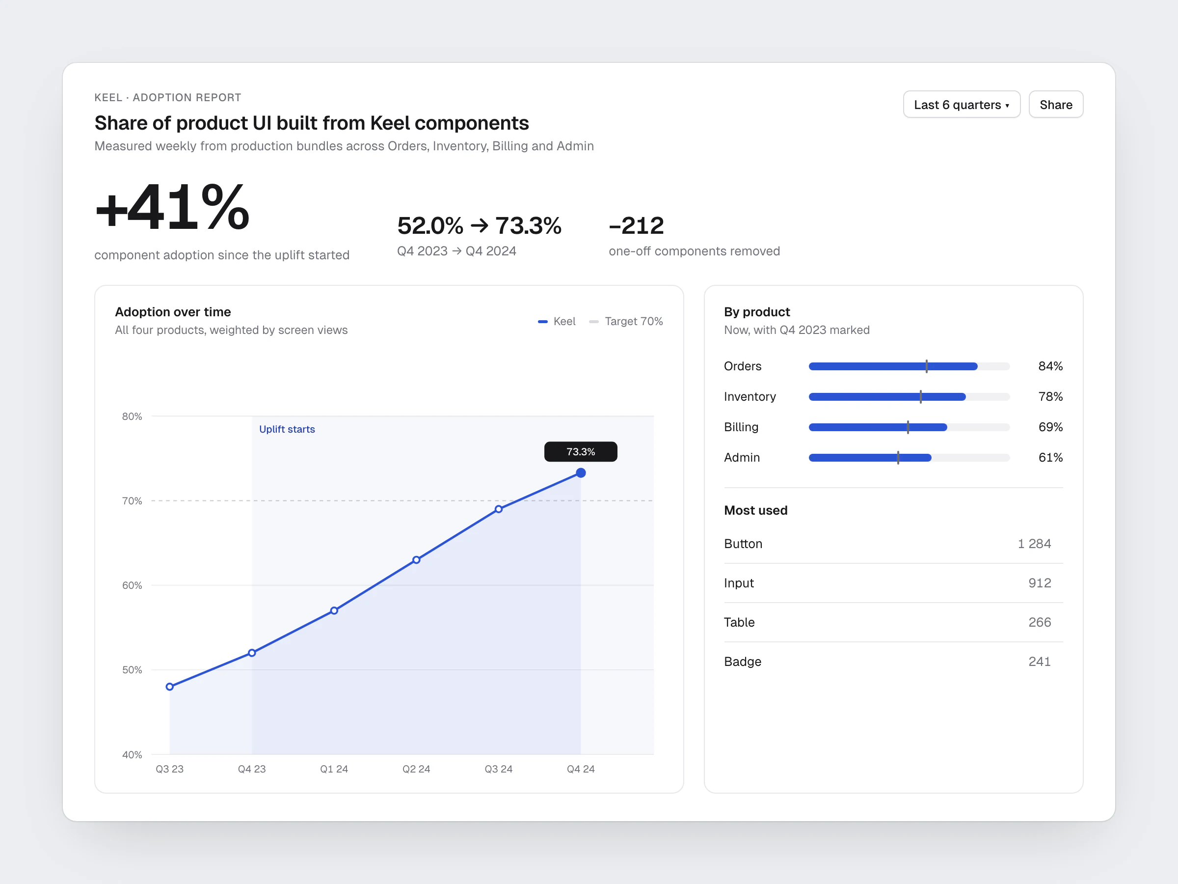
41%

increase in component adoption

42

components in the core library

−30%

time from design to merged PR

Problem

Four product teams shipped the same patterns four different ways. The library existed, but it lagged behind production and teams had stopped checking it. Every new feature added one-off styles.

My part

I led the uplift: audited all product surfaces, defined the token architecture, and co-designed component APIs with two engineers. I owned the adoption plan and the docs.

Approach

We started from production, not Figma: catalogued what teams actually shipped, collapsed it into 42 components, and made Storybook the source of truth. Tokens were generated for both Figma and code. We migrated the highest-traffic screens first so the benefit was visible early.

Outcome

Adoption became measurable and kept rising. Design reviews shifted from pixel debates to product questions, and new features shipped faster because the building blocks were already there.
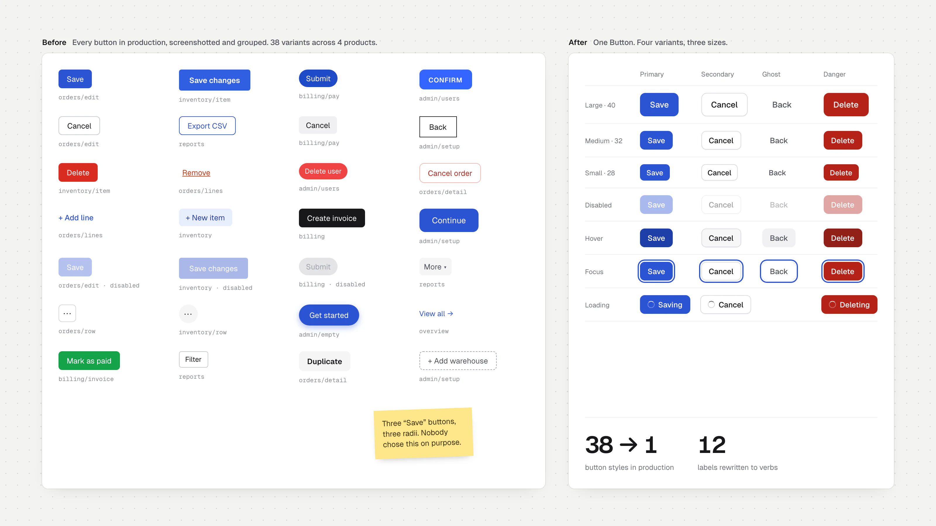
Audit board: 38 button styles found in production next to one Button component with its variants and states
The audit started with buttons. 38 styles in production, one component after.
Printed product screens pinned to a wall and grouped with string
Every screen from four products, printed and grouped by pattern.
Workshop wall covered in sticky notes listing problems
What teams said at the kickoff. Trust was the problem, not coverage.
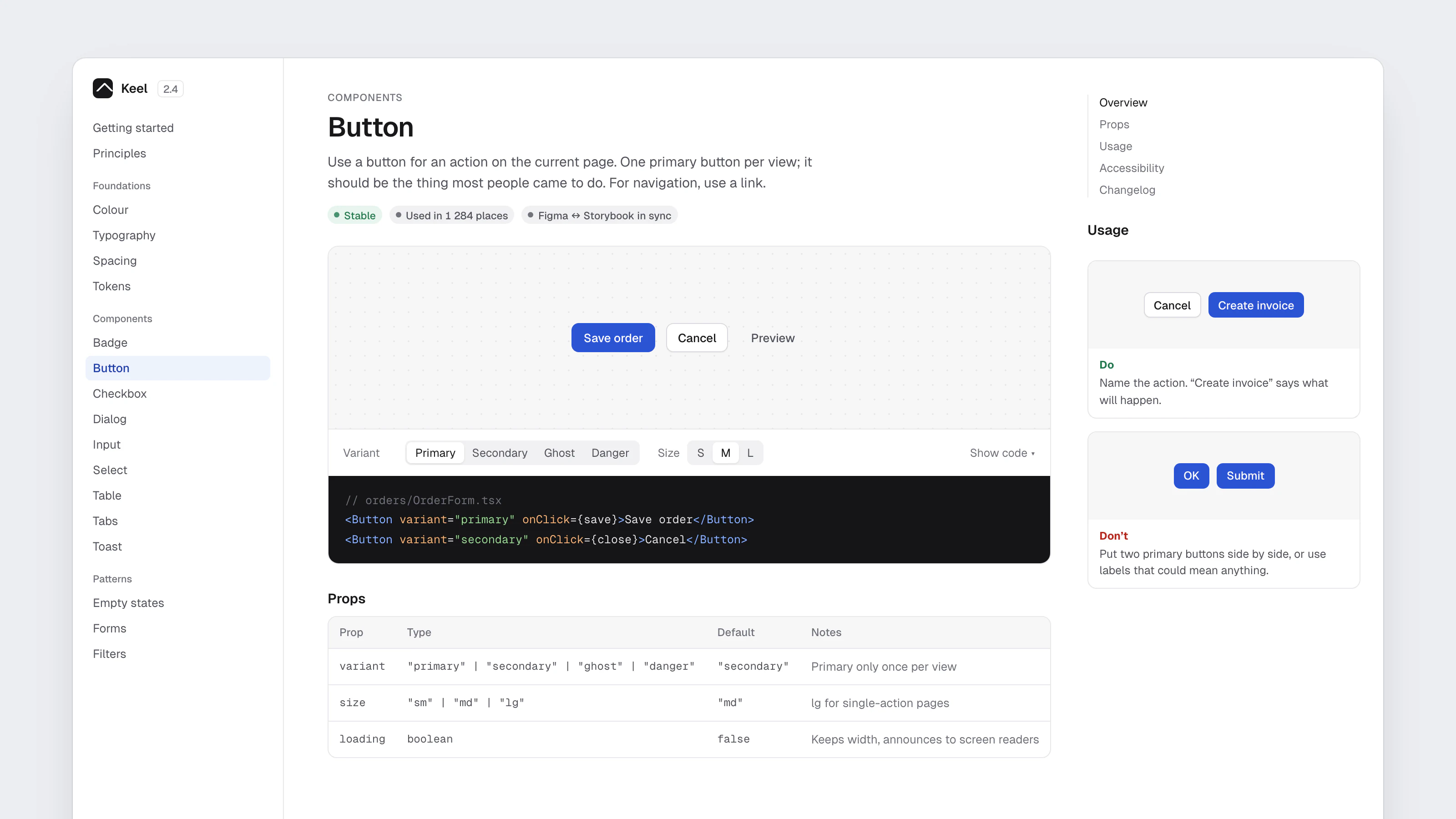
Keel documentation page for Button with a live preview, code and usage guidance
Docs for the person building the screen: when to use it, the code, a do and a don't.
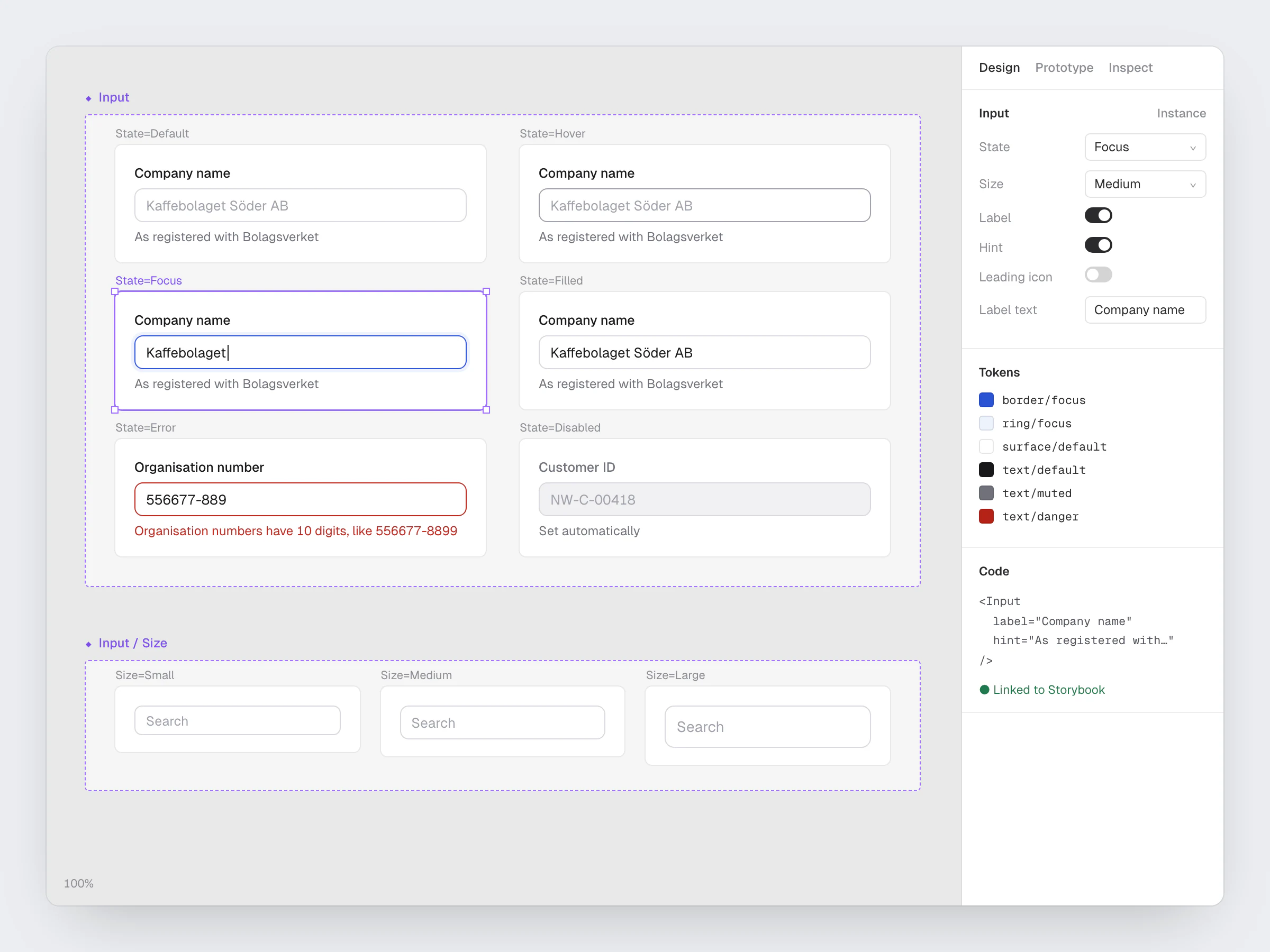
Input component set showing default, hover, focus, filled, error and disabled states, with properties and tokens
Every state designed, named the same way in Figma and in code.
Adoption dashboard: share of product UI built from Keel rose from 52% to 73.3%, a 41% increase
Adoption measured from production bundles, every week.
Four Northwind products, Orders, Inventory, Billing and Admin, built from the same components
Four products, one set of components.

Skills

Design systemsDesign tokensStorybookReactStakeholder management